I thought I’d start this post with a fact of the day – did you know that the very first museum audioguide was developed all the way back in 1952?

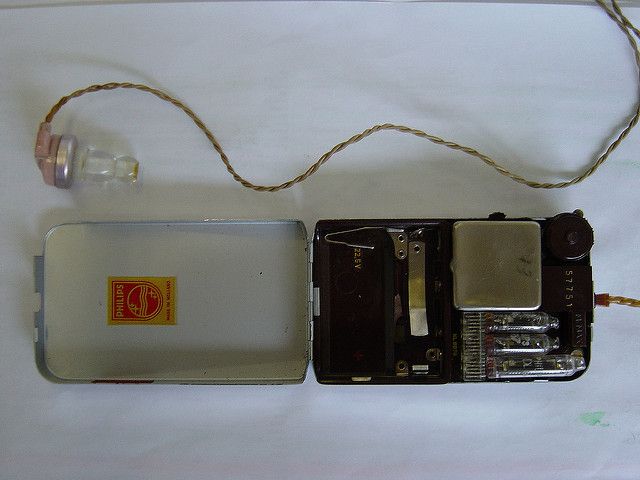
One of the first audioguide units from the Stedelijk Museum. Image Loic Tallon, licensed CC BY-NC-SA 2.0
Seen as a unique method for visitors to experience rich content that could go beyond the text panel or label, they were an instant hit and continue to persist in the expectation of visitors to this day. When I worked in a front of house role, requests for audioguides were one of the top four most asked questions I got, (along with how to get up to the galleries, how much it cost to get in and the location of the toilets). The reaction when told that we didn’t supply one was typically a mixture of confusion and disappointment.
This experience stuck with me and convinced me that audio as an interpretative tool is something that museums should continue to explore. After all, give the people what they want right? However, I also believe they are handy interpretive tools for the following reasons:
- They work very well in providing accessible interpretation, or if you want to supply something in multiple languages. The concept of an audioguide is almost universal and easy to get visitors to engage with.
- They can be much more engaging than a label or a screen, if done right.
- You can broaden the stories you tell and experiences you can create.
I was therefore very keen to try in gallery audio within the exhibitions and displays. I started to first investigate options in late 2016, using the following questions as my pre-requisite:
- Would this be accessible to our visitors?
- Is it simple to update and maintain content?
- Was it stable enough to not fall over?
- Could it track usage data so we could see how people were using it and what was working for them?
After a while, I came across an interesting product developed by the digital team at ACMI, initially to support one of their temporary exhibitions - a microsite generator to produce your own BYOD audioguide.

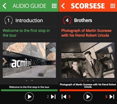
The Jekyll audio guide tool, as developed by ACMI
Built using Jekyll, the responsive site works well with practically every smartphone device (even looking alright on an HTC Hero, circa 2010). As the guide is built through static site generation, there is no CMS. Instead, content is added by creating and editing a number of files in Markdown which can be off-putting for users used to working with a friendlier interface. However, this approach has its benefits, especially if you want to keep it simple. As ACMI developer Andrew Serong discusses in his blog post:
…when you’re building smaller one-off projects with a small team, CMSs can be slow, frustrating and involve far too much performance overhead for the task at hand — especially if the content is expected to change often.
It seemed promising to try out within the galleries, but I still had to determine if it met those four key requirements. So, how did it do?
Question 1: Accessibility The guide has been tested against Web Accessibility standards and found to pass. Testing also proved it was mostly compatible with the principal accessibility tools on mobile devices (although voice description did hit a few snags)
Question 2: Easy to deploy and update? Everyone in the digital content team was able to add content to the stops. Initial errors were easy enough to correct by tweaking the files, then re-deploying. The audio stops themselves are written in Markdown, using a simple template format made up of key-value pairs, so it’s relatively easy to get your head around – take a look at the code for a stop below:
Question 3: Reliability Concerning reliability, static websites are amongst the most stable setups you can have. All that is served to the user is a set of flat HTML files which can be hosted practically anywhere and cause minimal strain - so I could happily use a Raspberry Pi when initially testing and demonstrating. (I of course, would not recommend this for a production environment). In production, you can use a CDN such as CloudCannon, or even host on Amazon S3. Finally, with no database required, you’re guaranteed no database errors!
Question 4: Can we get data? The microsite can easily integrate with Google Analytics, so we were able to create a dashboard to give us full analytic data on the guides use, even in real time. At the end of the tour, users are directed to a Qualaroo survey, to offer feedback.
Of course, I have a bad habit of fiddling with code, so I decided to play around a bit to see what else you could make the site do. After some tweaking, I was able to give an option for a ‘further information’ stop - useful if you have a lot of content that goes deeper. As well as this, the template can be configured to allow video playback (but this would likely put an increased demand on the server if you were streaming video rather than audio).

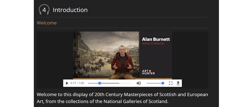
Audioguide stop, using video!
As it happened, the perfect chance soon came up to try this out with one of our summer exhibitions, Hill and Adamson: A Perfect Chemistry at the Scottish National Portrait Gallery. The show was a valuable opportunity as it allowed us to have a good window to test and gather data in (three months over the buildings busier period). Furthermore, as many of the artworks are from the gallery’s holdings, we knew that the content created would be easily reusable (which we intend to do), even if the pilot was not a success.
After a demonstration to the rest of the digital team, and the exhibition curator, it was decided to keep it simple for this show – sticking to pictures and short audio pieces (with transcripts) to tell the stories around Hill and Adamson’s work.
At this point, the codebase for the guide was passed to the team of designers and developers at the galleries external agency for them to setup the Amazon S3 infrastructure, and make the necessary changes to the design for the exhibition. Meanwhile, colleagues in the digital team planned out the flow of the guide, and with the exhibition curator, identified and recorded a series of stories to be told for sixteen objects in the exhibition. Examples of these include the story of the disruption of the Church of Scotland (and the planning of the epic painting that motivated Hill & Adamson’s partnership), the technical and artistic influences on the images that they created and the characters and friends who sat for them and promoted their work.
Once we had recorded, edited and transcribed the video content, the markdown files were written and run through the Jekyll generator to create the Hill and Adamson audioguide. Finally, instructions and labels were added to the exhibition and the FoH team were briefed so they could explain the offer to visitors.

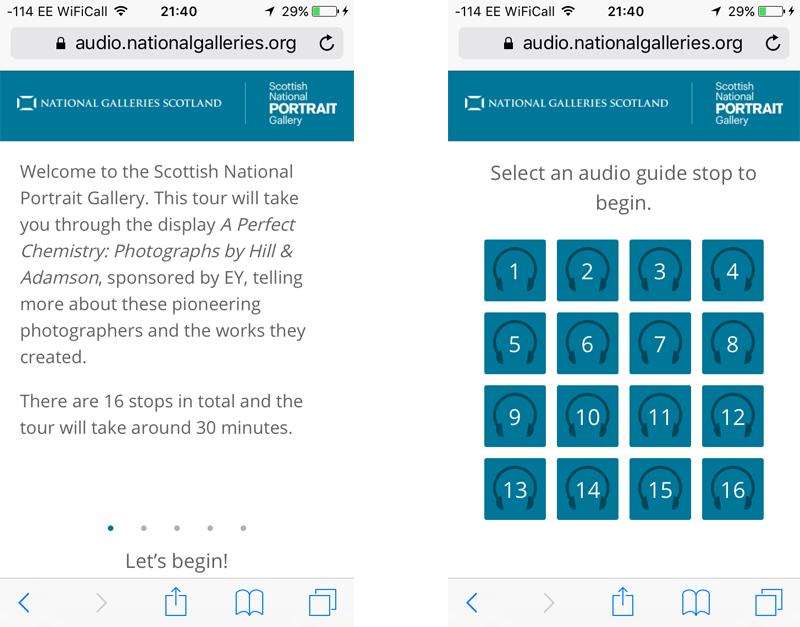
Audio guide introduction and main menu
It was ready to go, but would it be a success for the exhibition run? What snagging points and issues would crop up? Did people like the content? I hope to discuss this and other lessons learned in future once the exhibition has closed. In the meantime, why not give the guide a try at audio.nationalgalleries.org, or even come and see the show for yourself?
- The exhibition “Hill and Adamson: A Perfect Chemistry” runs until October 1st at the Scottish National Portrait Gallery. More information and ticketing is available at https://www.nationalgalleries.org/exhibition/perfect-chemistry-photographs-hill-and-adamson.
- You can learn more about ACMI Labs and their projects by following them on Medium.